![]()
![]()
Components like graphs, charts, and tables can easily be added to a Report Studio page from the task bar at the bottom of the screen. By default, quick add icons for all components are displayed. Click on the first section of the bottom task bar to select whether to display quick add icons for All Charts, All Tables, or All Components.
To edit the appearance of a chart or table, or to update the data included, click on the component to select it, and then use the Chart Settings or Table Settings menu from the bottom task bar.
Data Tables - Full Page (Green Icons)
Data Tables - Section (Orange Icons)
Available components include the Pie Chart, Growth Chart, Bar Chart (Calendar), Bar Chart (Trailing), Rolling Window, and X/Y Chart. Settings for each component is explained below. Settings that apply to multiple components are listed first.
Common Settings
As of Date - The As of Date is pulled from the system date of your computer. Use the toggle icon  to view or hide this option.
Chart Title - The displayed name of the chart. This field is editable and can be customized with your changes. Use the toggle icon to view or hide this option.
Time Period - The time period defaults to an annual range beginning with the current month of the previous year. Use the toggle icon to view or hide the display of dates.
Values - Use the toggle icon to view or hide the associated values for each bar on the graph.
Start Date / End Date - Use the drop-down menu to select from a pre-defined time period, or specify a custom time period by selecting Enter Date. The calendar date associated with the pre-defined time period is shown to the right of the option.
Time Periods - Only one selection is allowed. Choose from:
Single Period - Displays one bar (or window) based on your Start and End dates.
Trailing Periods - Displays multiple bars (or windows) based on your Start and End dates trailing. Your moving step will determine the frequency in which the bar (or window) will overlap within the period you selected. Here your Start date for each period will move while your End date will remain static.
Forward Extending Periods - Illustrates multiple bars (or windows) based on your Start and End dates from the beginning. Your moving step will determine the frequency in which the bar (or window) moves forward within the period you selected.
Rolling Window - Displays multiple bars (or windows) based on your Start and End dates. In this case, the Start and End dates both move together based on your bar (or window) size. Your moving step will still determine the frequency the bar (or window) will overlap within the period you selected.
Regular Periods from Start - Displays multiple bars (or windows) based on your Start and End dates. This selection illustrates the beginning period to ending period. Here, you can select your bar (or window) size, and the number of columns you would like to generate for your chart. However, you cannot select a moving step, meaning you cannot overlap your period.
Regular Periods from End - Displays multiple bars (or windows) based on your Start and End dates. This selection illustrates the ending period to beginning period. Here, you can select your bar (or window) size, and the number of columns you would like to generate on your chart. However, you cannot select a moving step, meaning you cannot overlap your period.
Window Size - This changes based on the Time Period selected above. This field determines the length of your return period.
Moving Step - This changes based on the Time Period selected above. This field determines the frequency in which your window size moves or overlaps within a designated time period.
Number of Columns - The number of entries to include within your window.
Selected Time Period - This section indicates the time periods that will be displayed on the graph. The Display Name for each period can be altered by double-clicking in the field to open it for editing. Use the drop-down menu associated with each period to change the display label for the period. The up and down arrows to the right of the time period table can be used to arrange the order of the time periods. Use the buttons at the bottom of the time period table to reverse the order of the time periods, or to remove selected time periods from the chart.
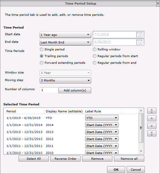
Chart Title - See explanation above.
Data Set - The selected data set controls the data points included on the graph. Use the drop-down menu associated with this option to select your data set.
As of Date - See explanation above.
Total - Use the toggle icon to view or hide the total percentage of data points included on the graph.
Data Point Settings - The Display Name and Color for each component can be altered from the lower section where the data points are listed. Select a data point and then use the up and down arrows to reposition its location on the graph and legend.
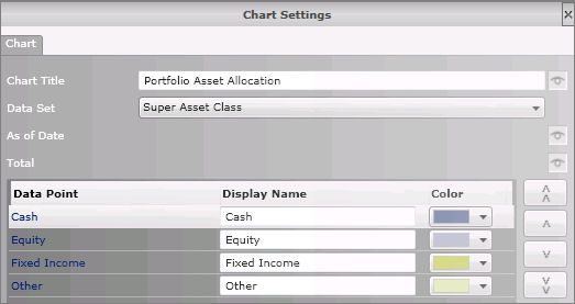
Chart Title - See explanation above.
Data Point - Use the drop-down menu to select from Portfolio Market Value or Cumulative TWR. This updates the Investment section at the bottom of the screen. Use the Display drop-down menu to select the appearance of the line on the chart.
Return Data - Use the drop-down menu to select the graphing frequency for return data. Select from Daily, Weekly, Monthly, or Quarterly.
Time Period - See explanation above.
Cumulative Contributions - The cumulative contributions line includes Total Additions - Total Withdrawals (including management fees) from inception. This option is automatically graphed when Portfolio Market Values is selected under the Data Point option. Use the toggle icon to view or hide the graph line for this option.
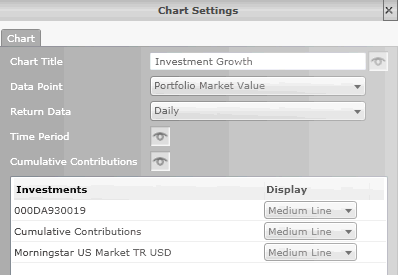
Chart Title - See explanation above.
Time Period - Click on the Setup button to open the Time Period Setup screen. The time period tab is used to add, edit, or remove time periods.
Values - See explanation above.
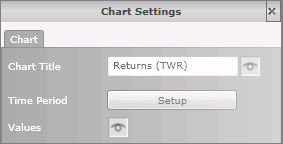
Chart Title - See explanation above.
Time Period - Click on the Setup button to open the Time Period Setup screen. The time period tab is used to add, edit, or remove time periods.
As of Date - See explanation above.
Values - See explanation above.
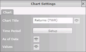
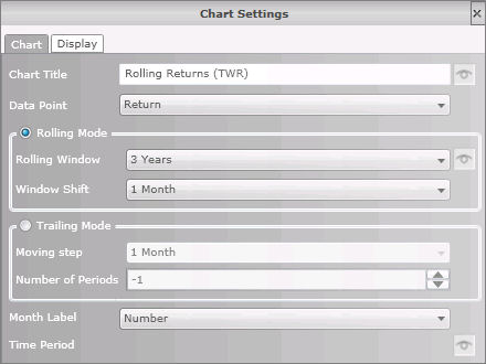
CHART TAB
Chart Title - See explanation above.
Data Point - Use the drop-down menu to select the data point to be graphed.
Select either Rolling Mode or Trailing Mode.
Rolling Mode - Rolling mode is used to create rolling time periods, where the start and end dates both move forward together. Rolling windows are typically used to measure consistency of data. Use Rolling Windows to set the time period for each column and Window Shift to set the increment for each time period column. Use the toggle icon to view or hide this display.
Trailing Mode - Trailing mode is used when the end date is fixed for each time period. The moving step sets the increment to each time period, and the number of periods specifies how many time periods to add.
Month Label - This option controls the display for the month graphed when Trailing Mode is selected. Use the drop-down menu to select Number to display the calendar month as a digit, or Name to display the first letter of the calendar month.
Time Period - See explanation above.
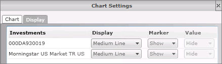
DISPLAY TAB
The Investment section shows the account number and Morningstar benchmark being graphed.
Use the Display drop-down menu to select the appearance of the line on the chart.
Select Show or Hide from the Marker drop-down menu to view graphed points on the grid lines.
If available, select Show or Hide from the Value drop-down menu to view the values associated with the graphed points.
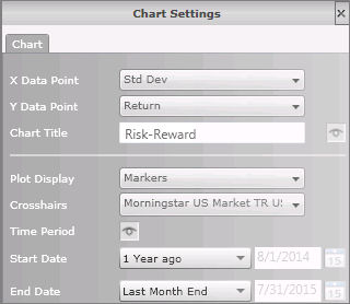
X Data Point - Use the drop-down menu to select the data point for the horizontal graphing values.
Y Data Point - Use the drop-down menu to select the data point for the vertical graphing values.
Chart Title - See explanation above.
Plot Display - Use the drop-down menu to select the type of symbol used for the plot display. Select from Markers, or Small, Medium, or Large Circle.
Crosshairs - Use the drop-down menu to select the holding where the intersection of the crosshairs will occur.
Time Period - See explanation above.
Start Date / End Date - Use the drop-down menu to select from a pre-defined time period, or specify a custom time period by selecting Enter Date. The calendar date associated with the pre-defined time period is shown to the right of the option.
Data Tables - Full Page (Green Icons)
Available components include the Portfolio Evaluation, Portfolio Period Performance, Transaction Ledger, and Realized Gain/Loss. Settings for each component is explained below. Settings that apply to multiple components are listed first.
Common Settings
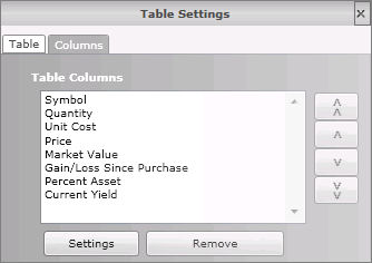
Table Columns - The template defaults to a set number of columns. To reorder the columns, select a column and then use the up and down arrows on the right. The double arrows move the column to the top or bottom of the list, while the single arrows move the column up or down one space.
Highlight a column and click the Settings button on the bottom to apply settings to that column. These include editing the column name, or changing the Scale and Decimal Places for numerical columns.
Highlight a column and click the Remove button on the bottom to completely remove the column from the table.
Note: To change the data points included on the table, go to the report template and click on the column heading. Use the drop-down menu to select the desired data points.
Display Summary Line - This line displays the value of the portfolio at the individual account level or the aggregate level (i.e., total portfolio).
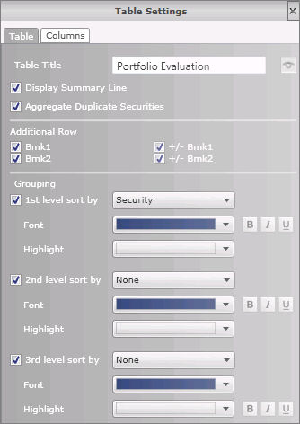
Table Title - The displayed name of the table. This field is editable and can be customized with your changes. Use the toggle icon to view or hide this option.
Portfolio Evaluation and Portfolio Period Performance
TABLE TAB
Table Title - See explanation above.
Display Summary Line - See explanation above.
Aggregate Duplicate Securities - Combine securities that are duplicated into a single row.
Additional Row - Select whether you want to include up to two additional benchmarks along with their +/- values.
Grouping - Include up to three different grouping levels to create a more visually pleasing report. Group by either:
Security
Asset Class
Asset Class or Equity Sector
Security Type
Super Asset Class
Broad Asset Class
Account
Once grouping are selected, use the formatting options to further distinguish each group.
COLUMNS TAB
TABLE TAB
Table Title - See explanation above.
Transaction Type - Highlight a transaction type from the lower section and click the up arrow to move it into the upper section. The transaction types listed in the upper section which occur during the reporting period will be included on the report. To remove a transaction type from the report, highlight the transaction type from the upper section and use the down arrow to move it to the lower section.
Transaction Filter - Use this filter to remove any Transaction Type from the component.
![]()
COLUMNS TAB
TABLE TAB
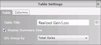
Table Title - See explanation above.
Display Summary Line - See explanation above.
G/L Group by - Gain/Loss values re grouped by either Total Sales, Long Term Capital Gains, or Long Term Capital Gains.
COLUMNS TAB
Data Tables - Section (Orange Icons)
Available components include the Performance by Account, Portfolio Performance Summary, Comparative Performance, Asset Allocation, Security Performance, Security Equity Sector, Security Asset Allocation, Security Trailing Return, and Security Calendar Return. Settings for each component is explained below. Settings that apply to multiple components are listed first.
Common Settings
Additional Row - Select whether you want to include up to two additional benchmarks along with their +/- values.
Display Summary Line - This line displays the value of the portfolio at the individual account level or the aggregate level (i.e., total portfolio).
Table Title - The displayed name of the table. This field is editable and can be customized with your changes. Use the toggle icon to view or hide this option.
Time Period - The time period defaults to an annual range beginning with the current month of the previous year. Use the toggle icon to view or hide the display of dates.
TABLE TAB
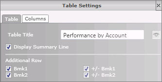
Table Title - See explanation above.
Display Summary Line - See explanation above.
Additional Row - See explanation above.
COLUMNS TAB
TABLE TAB
Table Title - See explanation above.
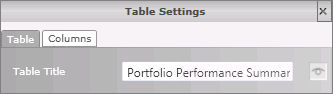
COLUMNS TAB
TABLE TAB
Table Title - See explanation above.
Time Period - See explanation above.
Start Date / End Date - Use the drop-down menu to select from a pre-defined time period, or specify a custom time period by selecting Enter Date. The calendar date associated with the pre-defined time period is shown to the right of the option.
Display Time Series - This setting displays the frequency of returns, in other words the rows that are displayed on the table. Use the drop-down menu to select Monthly, Quarterly, Semi-Annually, or Annually.
Display Report Period Data - Select this option to include data for the entire time period entered. This is controlled by the Start and End dates entered within this tab.
Display Since Inception Data - Select this option to include data since inception.
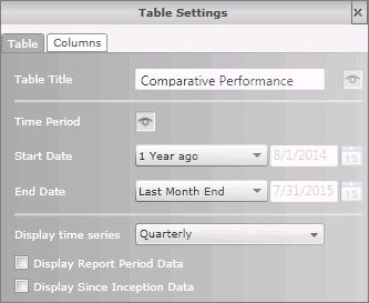
COLUMNS TAB
TABLE TAB
Table Title - See explanation above.
Asset Allocation - Use the drop-down menu to select the asset class set you want to display. This will display both the percentage of assets in each class as well as the market value.
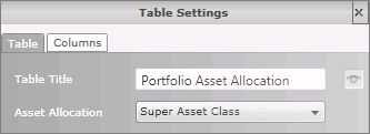
COLUMNS TAB
TABLE TAB
Table Title - See explanation above.
Time Period - See explanation above.
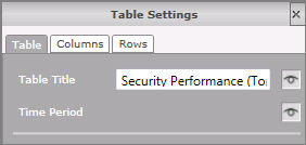
COLUMNS TAB
Table Rows - These include securities within the account. To change the display name for a security, highlight a row and click Settings.
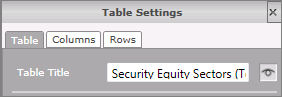
Security Equity Sector and Security Asset Allocation
TABLE TAB
Table Title - See explanation above.
COLUMNS TAB
ROWS TAB
TABLE TAB
Table Title - See explanation above.
Time Period - Click on the Setup button to open the Time Period Setup screen. The time period tab is used to add, edit, or remove time periods.
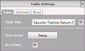
As of Date - See explanation above.
COLUMNS TAB
ROWS TAB
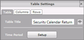
TABLE TAB
Table Title - See explanation above.
Time Period - Click on the Setup button to open the Time Period Setup screen. The time period tab is used to add, edit, or remove time periods.
COLUMNS TAB
ROWS TAB